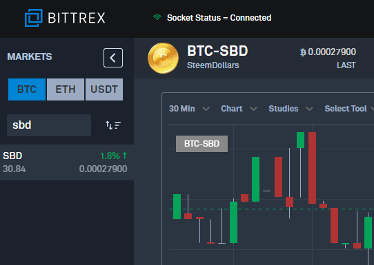
Earlier today when I visited the bittrex exchange site, I thought I had gone to a wrong website… Yeah, Bittrex has changed its look. So I googled to confirm it. Well, even if I were to find out that it’s not the case, it would be too late as I had already logged on…. >_<…
The new look is like the above screenshot. Other than the face-lift, news has it like the following:
Crypto Exchange Bittrex Is Taking New Customers Again
Bittrex Exchange Announces It’s Finally Re-Opening New User Signups
So, basically, it re-opens new user sign-ups (and due to huge influx of application suspended temporarily ha!), enhances their website with improved security and now supports for corporate accounts …
That’s good to hear…. But how come no one talk about the new UI, which, while you cannot say it’s ugly, is definitely inferior to its previous version, at least for now…
I know security is soooooooooo important for an exchange, but for bittrex, you can say that I expect higher. Since, really, I never have security issues with them, so naturally I focus on the details of daily operations.
Rant 1
Coin balances on the trading pages won’t automatically update after transactions/orders are filled/submitted, making me hard to keep track on how much coins I possess at each moment. I will have to refresh the page to see the accurate numbers… Sucks…
Rant 2
An old feature that I love the most about bittrex is that they show you the dollar value of the coin being traded in addition to its BTC price. This is such an important reference for me and now it’s gone. Sucks…
Rant 3
Actually I love the old layout where everything is mostly inside one page and it was easy to scroll down a little bit to see other info. Now the new look isn’t compact enough and I need to really scroll down a lot to see market history and open orders… etc. Can I have the old layout back, please!?
I know that by mentioning @bittrex won’t help as hey it’s not a human and I don’t think they will read steemit blogs. So it’s just my rant. If somehow they can see this post, then it’s even better.
I still don’t know what’s wrong with the old UI - it has no flaws in my eyes.
End of Rant.
This page is synchronized from the post: ‘Rant - Don’’t like the new Bittrex UI’