I never thought a single button could be this complicated standing from the designer point of view. Maybe nothing is if one tries to design a really nice looking UI that makes sense. Read more at Material Design Button.
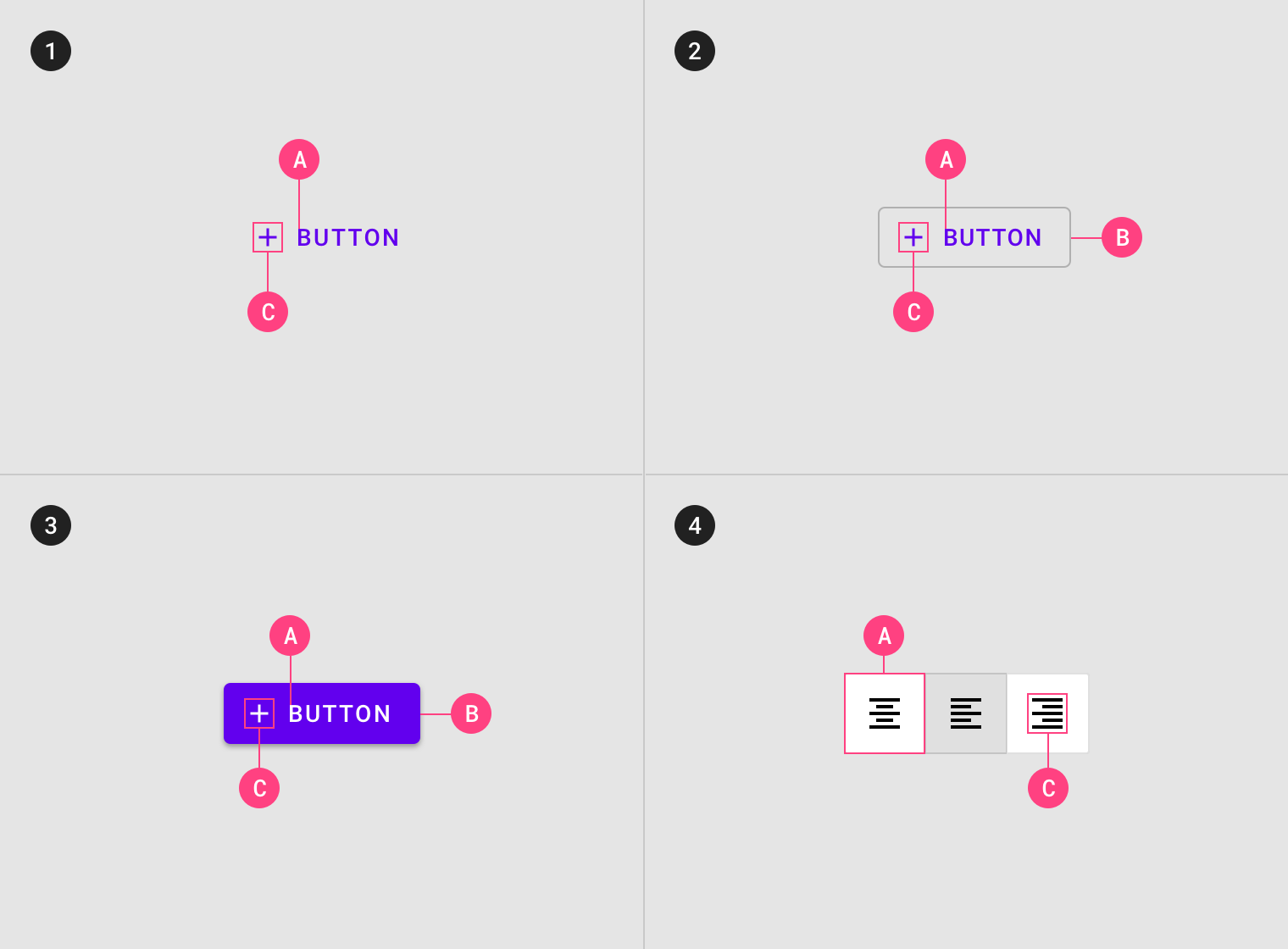
- Type 1 being the least important button while Type 3 with lots of emphases could be the most important button on the page.
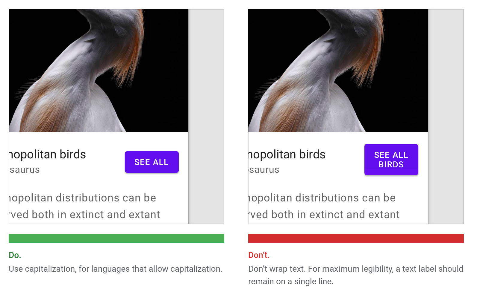
- There is nowhere else in a single webpage that should have a cleaner text within.
I never thought a single button could be this complicated standing from the designer point of view. Maybe nothing is if one tries to design a really nice looking UI that makes sense.
- There is nowhere else in a single webpage that should have a cleaner text within.
- A simple with outline container could be just as beautiful if the style matches the overall theme of the app.
While Material design is mainly meant for the mobile application, I genuinely think this spec for button design is a great advice and fundamental to follow for any application including web. Those extra padding and dimension not only give sufficient of breathing room for the text and icon within the button, but more importantly, it provides a bigger target for clicking.
Posted from my blog with SteemPress : https://fr3eze.vornix.blog/material-design-button-note/
This page is synchronized from the post: ‘Material Design: Button [Note]’