In a webpage or any UI, color is far more than providing a striking graphic or visual effect. Proper assignment of colors could give meaning that reflects the brand and style. It could also give meaning to elements on the interface or subconciosly make the state of element understandable without text explanation.
Notes below are taken from the Material design page:
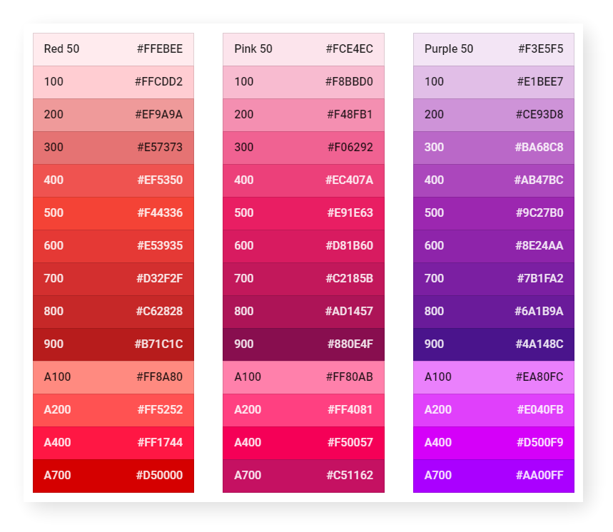
- [Color pallete](https://material.io/design/color/the-color-system.html#tools-for-picking-colors} that created in 2014 represents a series of harmonious color combination.
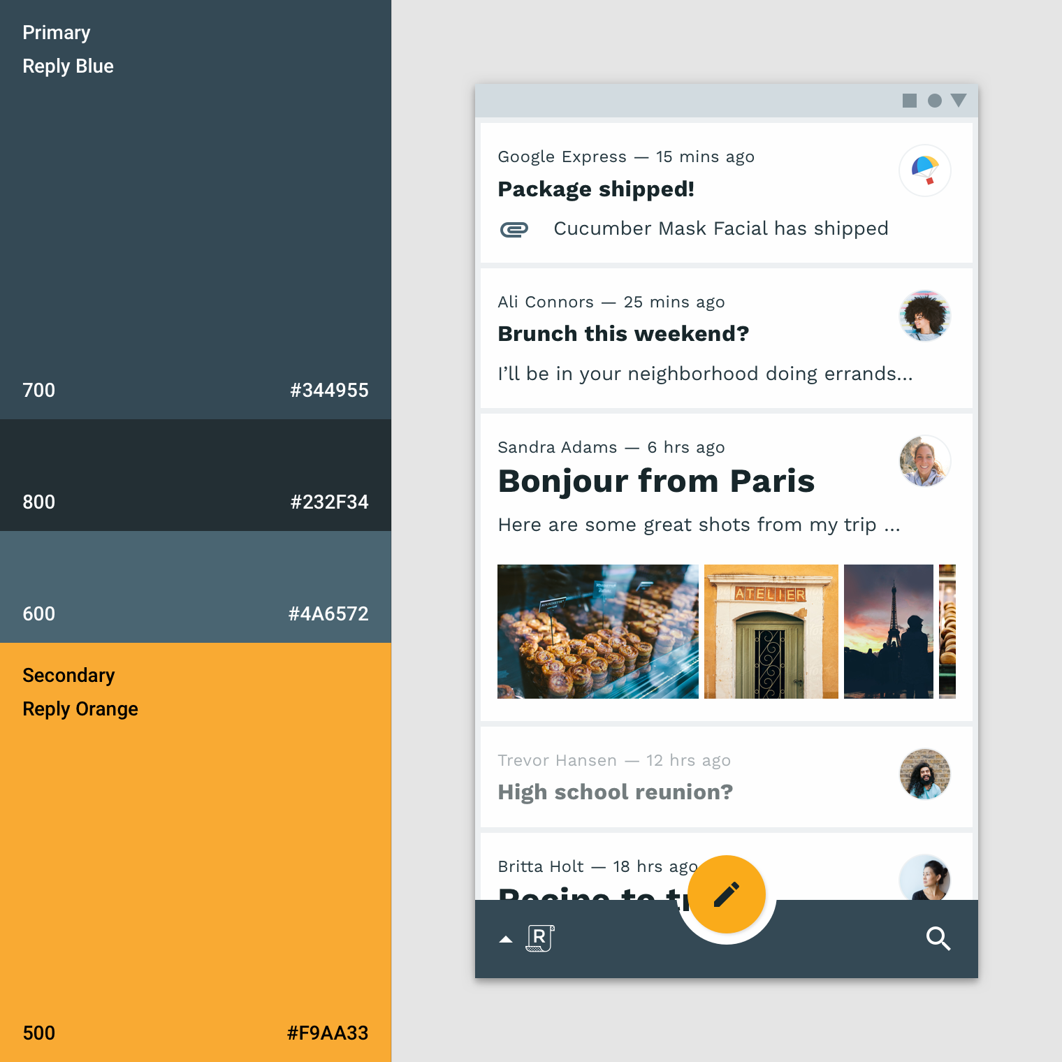
- Use a secondary color is highly recommended distinguish element with different features.
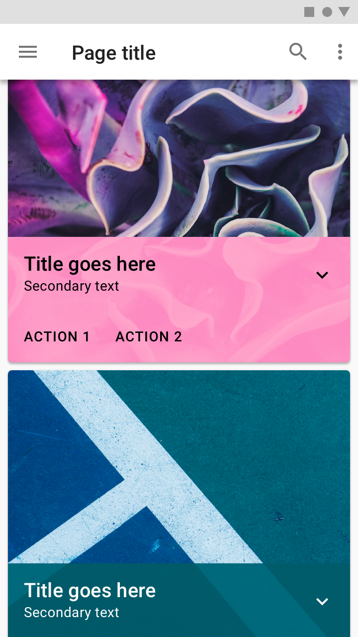
- Use a layer of color as text base for better legibility when a picture was used as background.
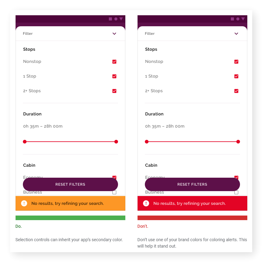
- Use color from different family for alert message to make it outstanding.
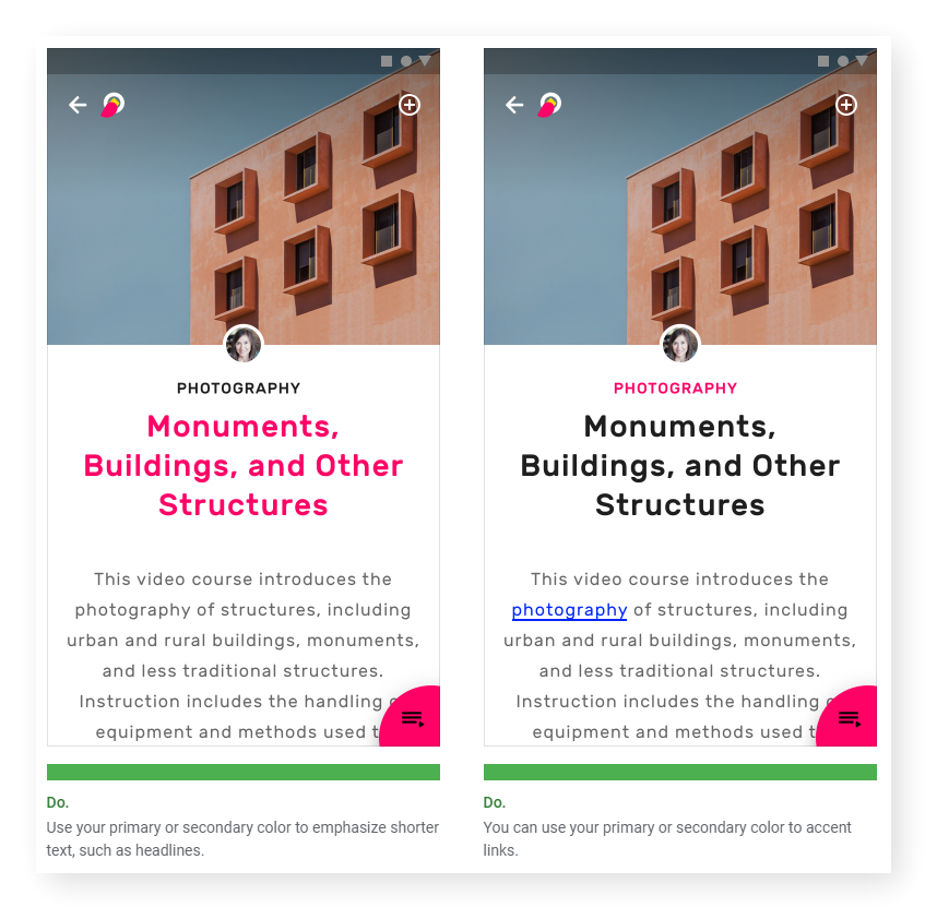
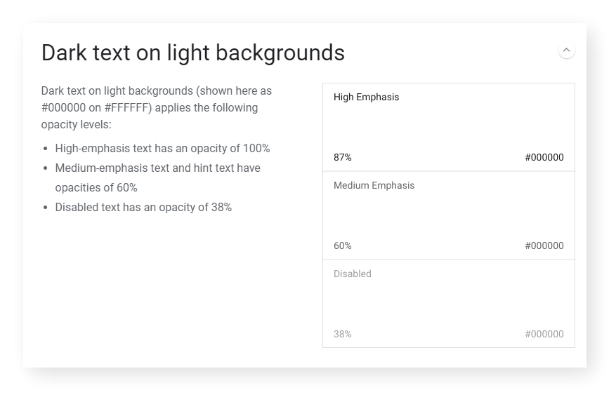
- Primary or secondary color is suitable for header or sub header color but body text color should remain subtle at all time.
Posted from my blog with SteemPress : https://fr3eze.vornix.blog/material-design-color-note/
This page is synchronized from the post: ‘Material Design: Color [Note]’