This post serves as a note from what I’ve learnt from the material.io:

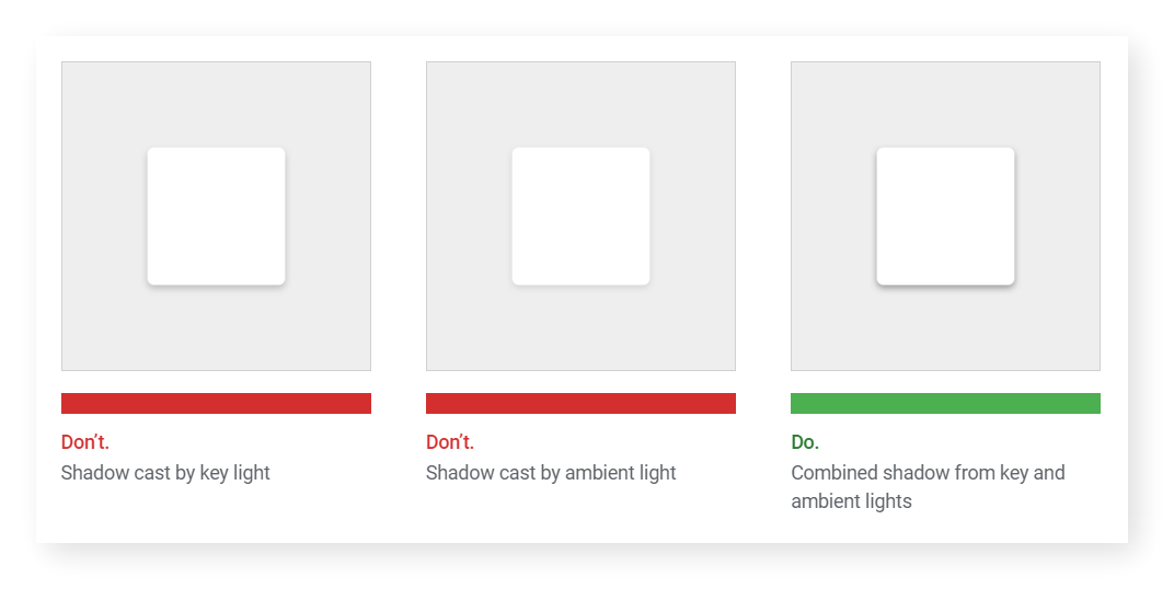
- Defualt elevation could be useful in creating a reasonable sense of depth in multiple layers like dialog, top bar, floating button and etc.
- Use [size of gutters[(https://material.io/design/layout/responsive-layout-grid.html#grid-customization) to give a sense for a ‘group’ of items.
- Breakpoint system sums up a great reference of columns amount and gutter size for various screen size.
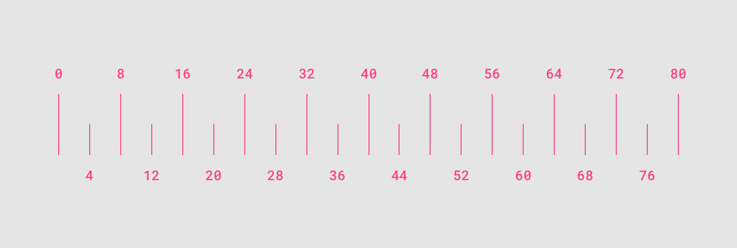
- Most measurements align to an 8dp grid applied, which aligns both spacing and the overall layout. Smaller components, such as iconography and typography, can align to a 4dp grid. Use any number that is dividable by 4dp in spacing would be a good idea.
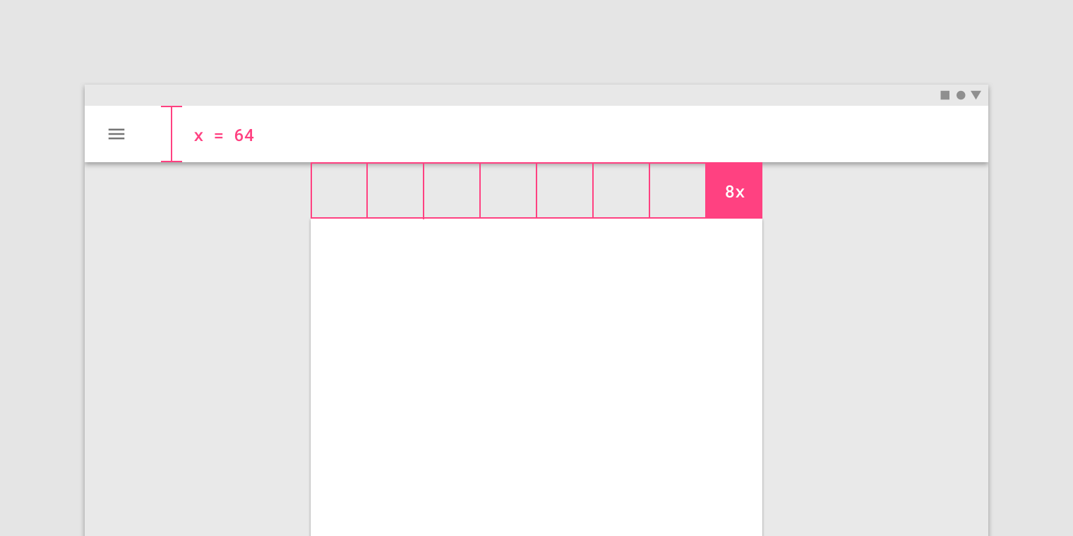
- Increment is a block with same height and width. To create a consistent sense in overall design, try to use the increment as building blocks to form the size of element like cards, bars, dialog and etc.
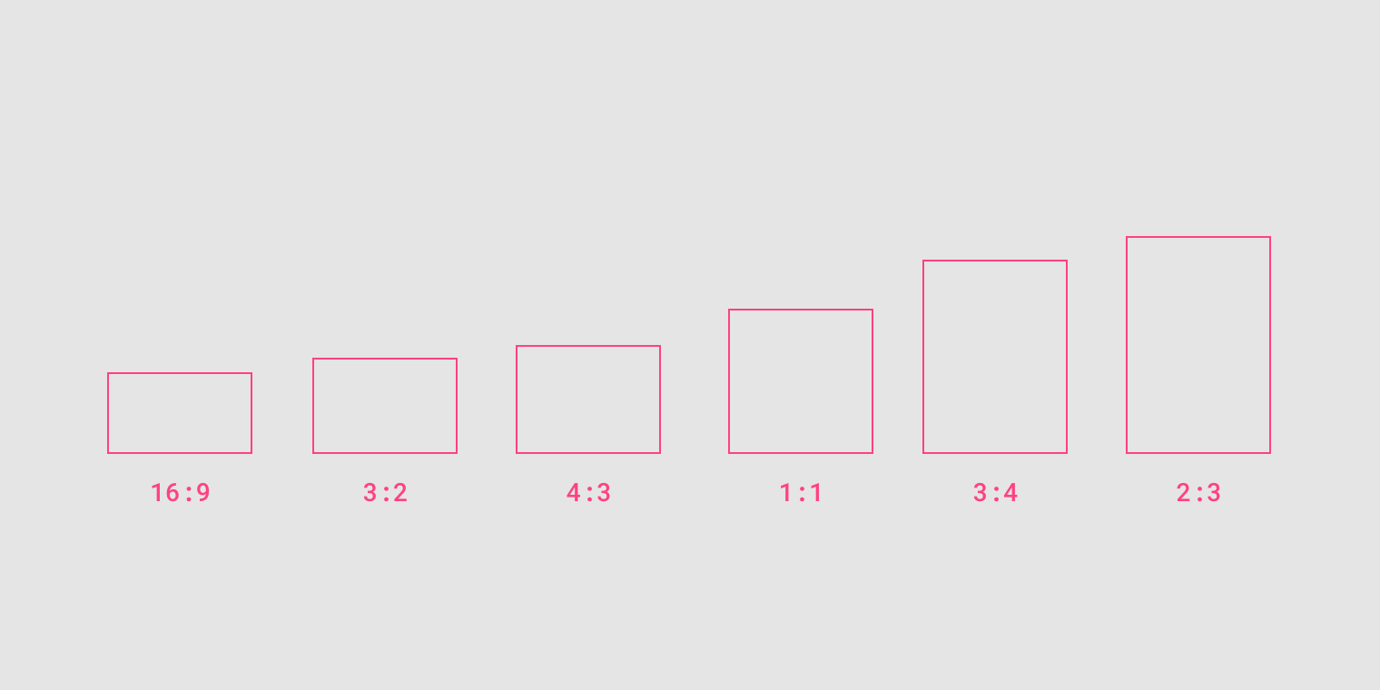
- Again, for the sake of consistency in layout, use a consistent aspect ratio on elements like images, surfaces, and screen size.
- Density is good to apply in list, tablesm and long forms which allow users to manage more items at the same time. However, focused task like dropdown menu, picker, and alerts and dialogs are not suitable for increased density.
 )
)
 )
)
- Higher density, wider margins and gutters. Vice versa.
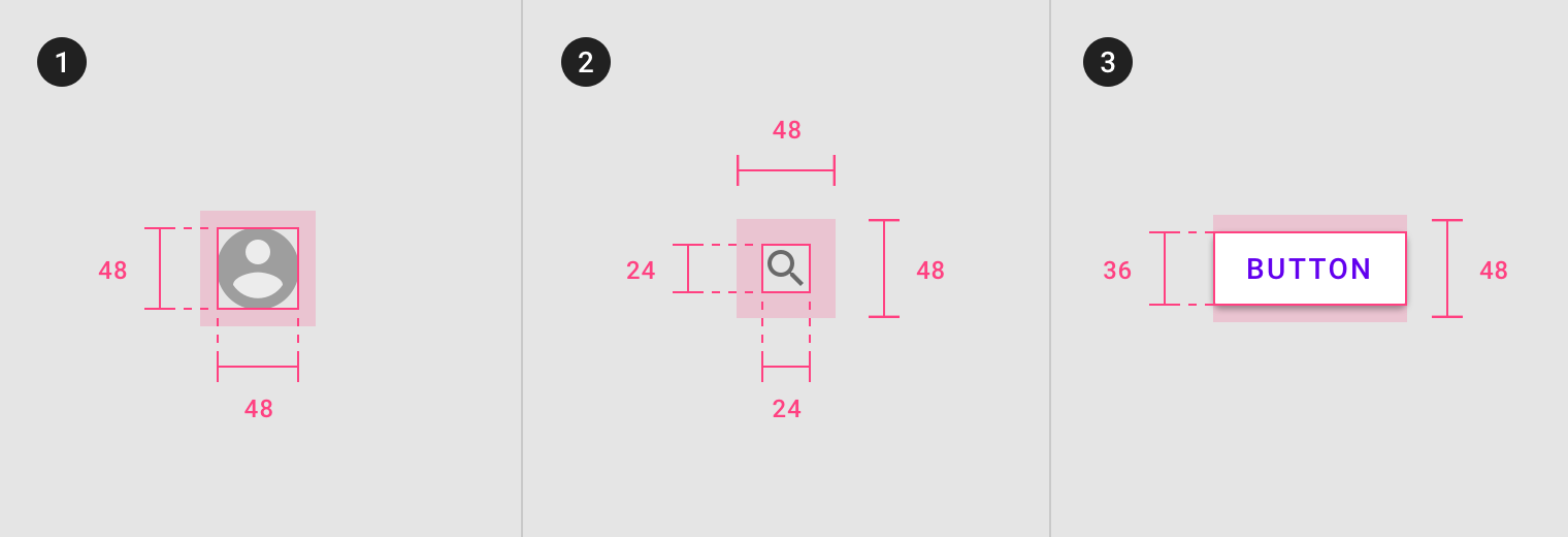
- Touch targets should be at least 48 x 48 dp, with at least 8dp of space between each target. Lower than 48 dp there will not as user-friendly for the touch target’s accessibility.
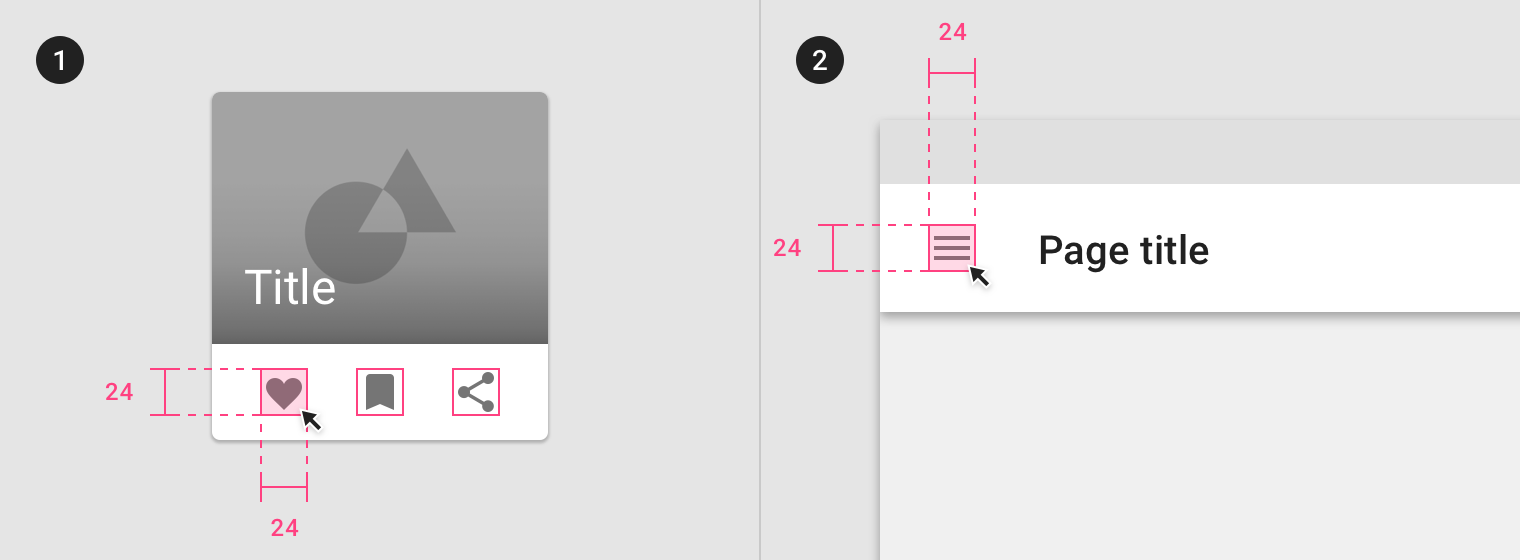
- Click targets should be at least 24 x 24 dp, with at least 8dp of space between each target.
Posted from my blog with SteemPress : https://fr3eze.vornix.blog/material-design-environment-layout-note/
This page is synchronized from the post: ‘Material Design: Environment, Layout [Note]’