Motion is one of the biggest parts in creating an interactive UI, if not biggest. Doing it wrong or overdo it could spell a big disaster to the overall feeling one application gives to its users.
- Exiting and closing can have a higher speed than the opening animation. As it requires less user attention than the user’s next task.
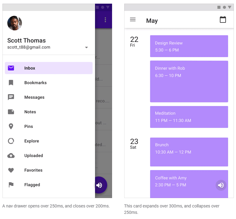
Relatively, animation of small area should use a shorter duration than those that traverse larger areas. For example, animation for icon has a duration of 100ms while a full screen popup could use 300ms.
Animation duration is best around 300ms. Make it shorter for a bolder feel, longer for a more relaxed effect.
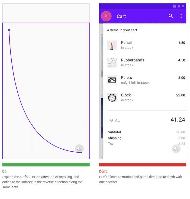
Determine the orientation to use by considering the motion of an expanding surface. The arc should match the primary scrolling axis of the UI. For example, a card in a vertically scrolling UI will expand using a vertical out arc. When the card collapses, the motion reverses, first moving vertically and then horizontally.
The Motion teaches tons of lesson that make sense and was a little bit overwhelming for my current standard to absorb it all. Definitely coming back to revise this chapter again when I had more experience in UX design. Great read!
Posted from my blog with SteemPress : https://fr3eze.vornix.blog/material-design-motion-note/
This page is synchronized from the post: ‘Material Design: Motion [Note]’