Typography is another crucial element in a front-end interface as it is often the most direct factor to convey a message to users. Mastering the art of typography not only can bring out the value of brand and style, but also increase the website aesthetic dramatically.
Notes below are taken from the Material design page:
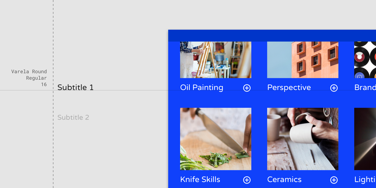
- Serif or sans serif typefaces work well for subtitles. Do not use expressive fonts for subtitles though as it is only suitable for header text.
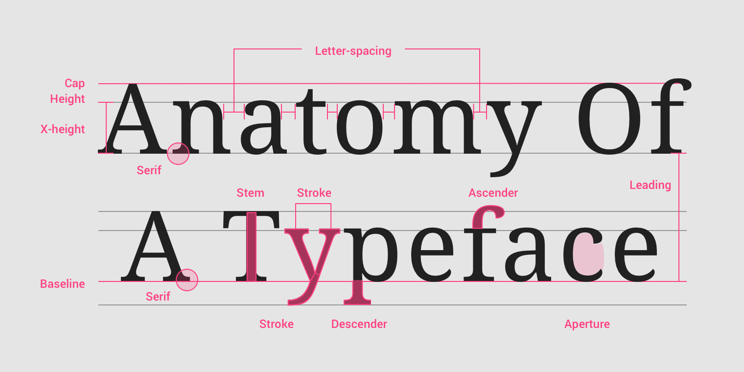
- Type properties explain brief typography concept in an overview.
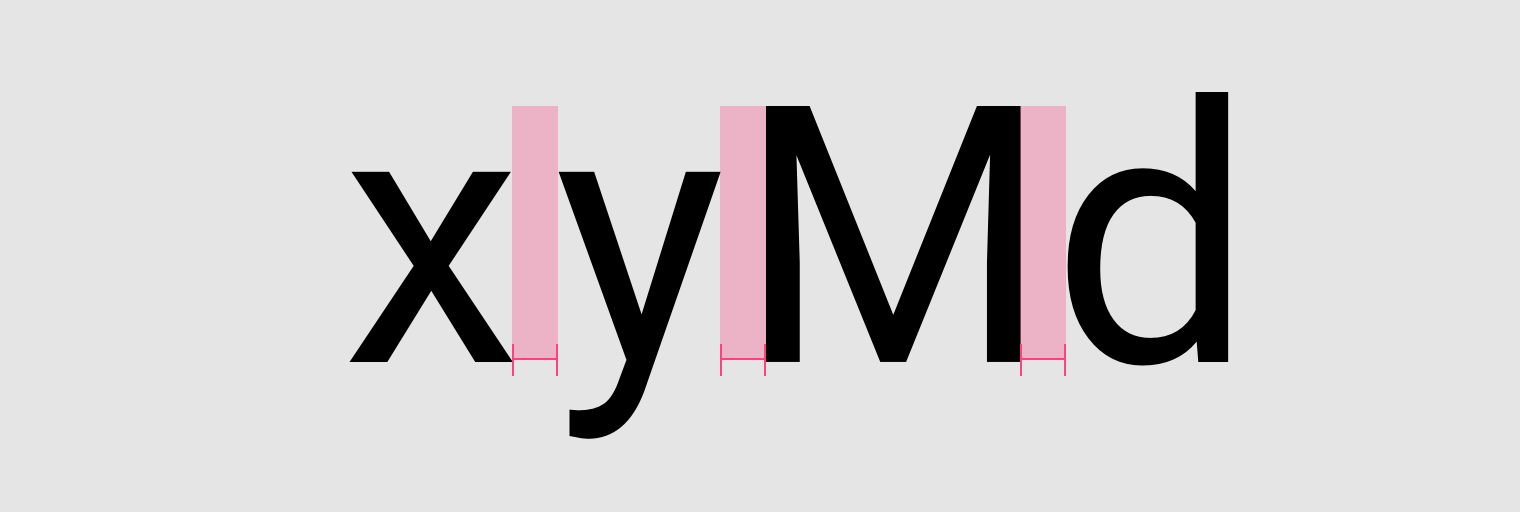
Smaller or more compact font size could use a looser letter spacing for better legibility and contrast. While larger type size can use tighter spacing.
Readability is crucial for body text. Ideal range usually between 40 - 60 characters. Could up to 120 characters in desktop mode.
Posted from my blog with SteemPress : https://fr3eze.vornix.blog/material-design-typograpy-note/
This page is synchronized from the post: ‘Material Design: Typograpy [Note]’